What are Japanese candlesticks and how can you use them? First, where and when did they originate? During the 17th century, Japanese rice traders developed candlestick charts to plot price movements. Japanese candlestick charts are often overshadowed by the use of various common technical indicators that are placed on the charts. However, the candlestick patterns themselves can be a powerful tool if we can learn to recognize a few of the common candlestick patterns. Traders can use candlestick patterns to better understand possible market sentiment.

The individual candlesticks are simply graphical representations of price movements for a given period of time. They are formed by the open, high, low, and close of any trading instrument. Japanese Candlesticks are used on all tradeable markets, including stocks, futures, forex, etc.

If the opening price is above the closing price, then a solid candlestick is drawn, which is a down or bearish candle. If the closing price is above the opening price, then a “hollow” candlestick is drawn, which is a bullish candle. Each Candlestick is made up of two different parts – the first is the “filled” or “hollow” portion of the candle, which is known as the candle body and is the difference between the open and close prices for a specific time frame.

The second element of the candlesticks are the lines above and below the candle body, which are normally referred to as the wicks, and represent the high and low prices for that specific time frame. For example, in the diagram below, if the price closes lower for the time frame, a down, bearish, or “filled” candle is formed, like on the left candle below. If the price closes higher, then we have an up, bullish, or “hollow” candle, like the candle on the right side below.

Two common but powerful Candlestick Patterns to look for are:

The Doji
One of the most popular candlestick patterns is the doji pattern. What is a doji? A doji is when the individual stock, or any other market instrument for that matter, opens, moves up or down throughout the market day, but closes at about the same price as the open. The lengths of the wicks (the high and low) can vary from short to long. The doji pattern indicates indecision in market direction between buyers and sellers. The long legged doji consists of a doji with longer wicks and indicates stronger indecision between the buyers and sellers.
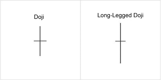
Traders can use the indecision indicated by the doji pattern to identify a potential weakening of the current trend. This can often trigger a price reversal in the opposite direction.

Engulfing Candlestick Pattern
Another one of the basic patterns indicating uncertainty in the market and a potential direction change in the market is the engulfing pattern. Examples of bullish and bearish engulfing candles follow:
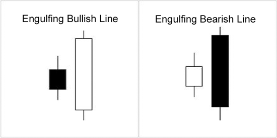
These engulfing candlestick patterns are a favorite pattern among candlestick traders because they are a good indicator of a possible market reversal. The pattern consists of two separate candles. The first candle is a narrow range candle that closes down. While the sellers are in control, being charted because volatility is low, the sellers are not very aggressive. The next day is a wider range candle that totally covers or fully “engulfs” the body of the previous day and closes near the top of the range. In effect, the buyers have overwhelmed the sellers. Buyers may be ready to take control and push the issue higher. Note in the current chart below of the EUR/USD 5 min chart, that the whole market sentiment reversed at the bullish engulfing candlestick formations. Also note that just before the bullish engulfing pattern, two dojis are also present, setting up market indecision first and then the engulfing pattern followed through on that market indecision and a change in momentum and trend occurred.
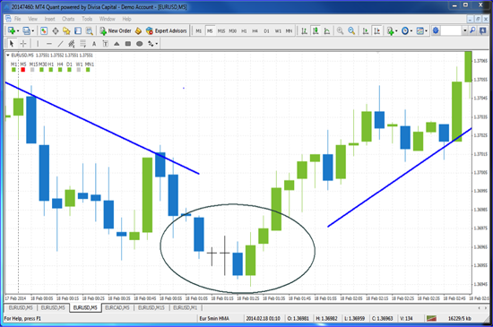
A bearish engulfing pattern would be just the opposite as the bullish engulfing pattern, indicating a change or reversal to the downside.

Conclusion
These two popular candlestick patterns, both dojis and engulfing patterns, can be used to help identify indecisive market sentiment and potential changes in direction. As illustrated, when both are present, there is an even stronger case to be made for a market reversal. Look for one of both of these patterns to help identify momentum price shifts.

When the long, upward trend that had gone largely unopposed since the end of 2012 began to pull back in late January of 2014, it seemed as though everyone was holding their breath in anticipation that it was ending with the big drop that everyone seems to be expecting. There were a lot of articles that were written that were presenting different scenarios of doom and gloom. There were a lot of reprints of articles that were written in November of 2013 that were comparing the 1928-1929 Dow charts to the Dow chart of today showing how closely paralleled the movement has been. Under those scenarios the market will be in for a drop of at least 3,000 points, bringing it down just a little less than 20% from current levels and right at 20% from the high of the beginning of 2014.

When the S&P dropped approximately 6% off of its high towards the end of January through the beginning of February, there were stories that this was the inevitable drop. It turned out that none of that was true. In fact, if you look at the facts, the drop that had occurred to the new lower levels happened while there was some pretty decent economic numbers that were coming out; there was little reason for the drop to occur at all. It is true that the housing numbers were not great and consumer sentiment was down, but, generally speaking, the overall numbers were not bad. When the market began to rise again, erasing much of this drop, the economic news that was coming out was probably worse than what was coming out when the drop occurred the days and weeks before. The obvious question that this brings about is what is the real story around all of this movement? It seems counterintuitive that the averages fall on okay to decent news, but rise and recover on less than that. Is the market just fulfilling the completion of the Dow price chart that mimics the crash of 1929? If that is the case, this is the time to take cover and run to cash.

It seems likely that the drop that we saw was more emotional and fear based than anything else. It appears as though there was a lot of indecision for a few weeks and, when the market stumbled a little, the drop gained momentum simply because traders and investors were expecting the worst. When that did not materialize, greed took back over from fear and fueled the recovery that has since been ongoing. It appears as though the rise that is recouping the recent loss is more real than the drop was. The indices were at high levels but flat for several weeks leading up to the drop but they seemed as though they were stable or at equilibrium. The frantic drop disturbed this equilibrium but the ensuing rise seems as though it will bring the averages back to, or at least very near, their previous levels, which will again be back to equilibrium.

Historically, we see a 10% drop in the market averages about once a year and a 20% drop every 3 years. It’s been about 3 years since the last 20% drop, so there is a likelihood that a good-sized drop will happen in the near future. This isn’t a bad thing at all; in fact, it is necessary and very healthy. We have seen this occur over and over again throughout the years and this next drop will probably be no different than any of the others in the respect that we will see a drop and then a recovery. Shorter-term traders and investors may consider moving to cash or at least moving a good amount of their holdings with a cash emphasis. But, generally speaking, there is no reason to worry or panic about this at all when it occurs. All you can do is protect yourself as much as possible and take a defensive stand when there is a possible downturn looming and wait to get back on the offensive side when it does occur and there is a sale in the market. If you go to a department store to purchase an item, do you want to purchase it at full price or at a discount? Most people would say at a discount, so why do we want to pay full price for our investments when we can wait and get them at a discount? A good size drop in the market is not a problem at all; it is an opportunity to make some money after the fall. It may sound a little aggressive, but when there is blood on the street, it’s time to take advantage and make cash.

After more than a year of downward movement on gold, we are starting to see some signs that the price might be heading up once again. As we look at what gold has been doing, it’s clear that the trend is the key factor in knowing the direction we should be trading. Once a clear direction has been established, we will want to take advantage of that momentum. If we would have only shorted gold during this time, we would have done very well with our trades. Currently, we are seeing the chart take some steps in a bullish direction.

Take a look at this chart below:

This is the daily chart of gold going back to August of 2012. On the chart, you can see the red line that is indicating the current downtrend; this trend line is also the area of resistance. As the price moves down and then back up to the resistance area, you can see that the pressure was put back on to push the price lower. You can see that the green circle is the area that shows the price finally breaking up above this resistance line. This would be the indication that the downward pressure is weakening and the bulls are beginning to show some strength.

Take a look at this chart below as we zoom in to look at it a bit closer:

As we have identified a breakout of resistance, we will now focus on looking to trade gold to the upside. We can do this on the daily chart or we can take this info to the shorter-term charts to look for trades. Let’s drop our time frame down to look at the hourly charts. On this chart below, you can see the red line that it broke through to begin to move up. You can also see the green line that has been created as the trend began to move up on the hourly chart. In this case, we would simply look for our trigger to enter a trade based on our buy rules.

The question we need to ask ourselves is, how long will this go up? The answer is, who knows? The important thing to look for is, when will the chart show the trend has ended? You will want to wait for the chart to actually show a break of the support before becoming too bearish. Until then, we will keep looking for buying opportunities in gold.

As we remember the importance of trading with the trend, we will be placing our trades in the correct direction. With gold beginning to move up again, we will want to look for the opportunities to buy. If gold begins to move in a long-term uptrend, we will be happy we took the time to identify this new upward movement. As you apply your trading rules to this, you will begin to see the possibilities of trading gold in this new uptrend. Of course, if it fails, it can always move back down, so make sure you use good risk management in all your trades.

Prepare Yourself Mentally Before Trading
Before the trading day begins, make sure that you are in good “trading shape”. Do you get a good night’s sleep, are you in good physical condition, and are you overly stressed about any personal matters? How you feel physically will affect your mindset and trading psychology, which will affect your performance during the trading session. So get plenty of sleep, eat well and get some exercise. Your body will feel better and you will be much more mentally focused on your trading. If you are ill or not feeling your best, consider skipping the trading session. I talk to traders all the time who say they knew they were in no condition to trade, but did so anyway. It takes discipline to know when not to trade!

Follow Your Entry and Exit Rules
Whatever your rules are for entering and exiting trades, make sure that you have them written down, that you have gone back and tested them against historical data, and that you have paper traded the entries and exits (forward testing). Testing your system rules will build your confidence in the rules and the outcomes, allowing you to be more patient with your trading and calmly execute the trades without second guessing each and every decision. Once you have confidence in the rules, follow them!

Follow Strict Risk Management Rules
There is no “Holy Grail” system in trading! You are going to have some losses – it is just going to happen and the better you are about taking losses, the better your discipline will be. Therefore, it is important that you have and follow good risk management rules to limit your losses. If you can understand your initial risk and have tested the system, you will have the discipline to take the next trade after a loss, according to your entry rules, without letting your emotions getting the better of you. A good rule of thumb is to limit your risk per trade to no more than 2% of your overall account. Also, it is best to determine the overall risk or the total number of open positions you will carry at any one time. So, based on your risk tolerance, determine your risk rules and then follow them.

Document and Evaluate Your Trades
It is very important to keep track of your trades. Most traders refer to this as a trade record or a trade journal. Almost every trader has heard that it is an important or good idea to journal your trades. However, I am always surprised when I hear traders that do not do this regularly. If you want to get better at anything you do, it is important to keep track of current behavior. For example, most people cannot lose weight until they understand exactly what and how much they are eating by way of keeping a food journal. Trading is the same way – unless we track exactly what we are doing, and more importantly, why we are doing it, we will have a hard time improving. At times our trading record can become just a big blur of executions. So keep a trade journal of all of your trades and why you made the trade in the first place and then what happened to each and every trade.

Conclusion
These four steps will allow you to manage your trading psychology better and allow you to control your emotions, which will lead to more disciplined trading.

Good luck and happy trading!

If you are not familiar with this term, you will most likely hear it some time during your days of trading in the market. This is a saying that refers to the idea of buying when prices are low, then selling them when they have gotten higher. For example, if you buy at $10, and then sell at $20, you have made a profit of $10. This seems simple enough, but sometimes we forget that is what we all are trying to do.

If we understand this saying, the question should be – “How will I know when the price is low and when it is high?” This is a great question and one that we all should be trying to answer. The actual answers should come as part of having an overall, well-defined, trading plan. The trading plan or strategy that you are trading should tell you when the price is low and when it is high. If we have that, we will be better at understanding when to enter and exit a trade.

As we look at better defining this saying, we will recognize that it really becomes a matter of understanding the price action on a chart. As we learn to identify the trend of the chart we are trading, we will be looking at the highs and lows that are formed on the charts. If the prices are making higher highs and lows, then the trend is up. If the prices are making lower highs and lows, then the trend is down. Once we have identified the price action as up or down, we will be able to see when the price is low and when it is high.

Once we have done this, we now know when to buy. We could look at this saying in another way so we can know when to short. It might be turned around and we would sell high, buy low. In this case we would be dealing with the price action trending down. Whether we say it this way or the other, the important thing is identifying the high and low areas.

Another version of this saying is to buy high and sell higher or sell low and buy lower. This would hold true if we are looking at breakout trades where the price may have already made a move up or down.

As you look for these high and low areas, it is important to go back to the basic elements of evaluating a chart. First we look at the trend and the price action occurring, then we look to identify support and resistance in order to know where these highs and lows are happening. Once we have done this, we can follow our rules that will help trigger us into a trade.

If we have our rules and can read a chart, we will be putting ourselves in the best possible position to be successful in our trading. There are no guarantees, but being able to look for highs and lows can put the edge in our favor. Take some time to review this and see how well you do at picking out high and low areas on the charts.

We have discussed using flag and pennant price patterns to identify the continuation of a trend in the market. Now, let’s discuss price patterns that would help to identify or predict a change in direction or current momentum from a current trend.

There are some specific price patterns, which you can use to help identify a market shift or change in momentum from the current trend. These patterns are often referred to as market reversal patterns. While these patterns do not always show up in every market reversal, when they do show up they are very powerful indicators of a weakening trend and a possible reversal.

Head and Shoulder Reversal Patterns
At the top or bottom of the market if you can see a head and shoulders pattern set up with two shoulders and head with a support line called a neckline like the chart below on the EUR/USD. The pattern found in Figure 1 is referred to as an inverted head and shoulders pattern because it found at the bottom of a market in a down trend and is opposite of the head and shoulders pattern found at the top of a market. The neckline is the resistance level at the top of the pattern. The head and shoulders pattern is similar to a triple top or triple bottom but the middle peak is higher or lower than the shoulders level, setting up the head and with the two shoulders and the neckline as illustrated.

Figure 1: Inverted Head and Shoulder Pattern

Double Tops and Bottoms
Double Tops and Double Bottoms are fairly common reversal patterns. These are also commonly referred to as an “M” pattern for the double top and a “W” pattern for a double bottom. A good example of a double bottom or “W” pattern can be found in the current chart of the AUD/USD Forex pair.

Figure 2: Double Bottom or “W” Pattern on the Daily AUD/USD Forex Pair

Triple Tops and Bottoms
In addition to the double tops and double bottoms we have a similar pattern that when it sets up can be a very strong indication and even stronger than the double tops or double bottoms. A good example of a triple top is also found on the AUD/USD Forex pair in the following chart. Note that once the support level at the bottom is broken after three attempts of the price action to move higher and just doesn’t have enough momentum to move higher will often reverse and move lower.

Figure 3: Triple-top with Price Breaking Below Support

Conclusion
These three types of reversal price patterns, head and shoulders, double tops and bottoms, and triple tops and bottoms are useful for helping traders identify the possibility of a market reversal. It is important to understand how these patterns rely on established principles of support and resistance. As illustrated in the charts, for the pattern to be complete, the price action completed, and confirm the pattern by breaking up or down through support at the top of the market or up through resistance at the bottom of the market. Look for these patterns on the charts and see how often they indicate clear change in momentum.

I have heard traders in the past state that the economic news that comes out effects the market very little from their standpoint because they are trading on longer-term charts, such as daily or weekly charts. When I hear something like this, it reminds me of a person driving a car with their eyes closed. I wonder if they are only interpreting a very small amount of the data that is available, if any at all, to base their trade decisions upon. If you look at a daily chart of how the market had been moving through January and into February, a new all-time high was reached in the S&P 500 in the middle of January. But at end of the third week, and into the last week of January, we saw the low of January and the low of December taken out and the first week of February took out the November low. Though this was an impressive few-day drop, it was only a 4.3% retracement, which was less than double the December retracement and about three times greater than the November retracement. The market had retraced in November and December, but not with much enthusiasm.

Taking a look at the week of Feb. 3 though Feb. 7, 2014, the economic data that was presented began on Monday when it was reported that manufacturing output was down for January by a substantial amount versus the amount that was estimated for the month and it was down even more versus what December’s actual number was. This roiled the market and gave it a reason to take a relatively big one-day drop, though some people argued that this manufacturing decrease was likely weather related and not something to be too concerned over. The market was definitely getting jittery, though it stabilized on Tuesday and was very jittery again on Wednesday when bad Non-Farm Employment numbers came out. Again, the argument was made that this was at least partially weather related so it may be exaggerated to the downside.

Overnight Thursday we saw that the UK and the EU both kept their interest rates unchanged and the head of the EU had a press conference and basically stated that they are aware of their low inflation number, but they are not going to rush to change their economic outlook or policy. This information, along with unemployment claims in the US dropping, was very well-received by the market, which managed to erase about 18% of the total retracement since the high was recorded in the middle of January. Thursday going into Friday was a very interesting time because the actual Non-Farm Employment numbers were due out, along with the unemployment rate, but many people were already almost discounting the information, stating that if the number was good, it means that the economy is continuing to improve. But if it is a bad number, it really doesn’t matter much because it was likely weather related. The number came out under expectations, though the unemployment rate still dropped by 10 basis points. The 10 basis point drop looks really nice on paper, but it is probably as much a result of unemployed people leaving the work force, so they are no longer counted as unemployed as much as anything real. This was set up going into Friday to be a no lose situation and the market loved it, regardless of the bad numbers, recovering another 18.6% of the recent retracement. The Thursday and Friday trading days recovered approximately 36% or just over 1/3 of what it took about three weeks to lose.

The point of all of this is that, regardless of the time frame charts that you are trading on, what is actually happening around the world is just as important as what the perception of what is happening is and it does effect trading. From an economic standpoint, were we really better off or more stable between Wednesday and Friday? What transpired in those few days was a bad Non-Farm Payroll estimate, better unemployment claims numbers, and then bad actual Non-Farm Payroll numbers. Was this really enough for the market to justify recovering 1/3 of the previous retracement? I don’t personally think so, but the market is actually people and people have attitudes and ideas; people can speak what they believe into existence and, if enough people speak and believe the same thing, it will happen. From a traders standpoint, you don’t need to be able to explain or analyze it, you just need to know that it’s there so you can prepare yourself for whatever the perception of the truth is, which is what moves the market. It doesn’t matter that there is no real difference between Wednesday and Friday; all that matters is that enough people believe that there is, so the market moved. Look for the prevailing attitude, not logic or reality, and you may be able to ride some of the market waves, regardless if they are real or imagined.

Today we are going to look at the daily chart for silver and evaluate what is going on with the price action. Whenever we look at analyzing what is going on with a chart, we need to look at a few, very important things. All these things deal with the price movement on the chart. One of the things we want to identify is the direction or trend of the current movement. This will give us the general overview of the likely direction we should be trading. If the trend is up, then we will be buying and if it is down, we will be looking to sell. Another thing we want to identify is the current momentum of the price action. This is different than the trend and really shows the shorter-term directional movement. This is usually identified as a retracement, or pullback, on the chart. The last things we will be looking at are where the area of support and resistance are located. We use the term “area” because we know that the support and resistance can have a range that takes effect. Now that we know what we are looking for we can look at the chart for silver.

In the chart below, we can see the daily candles for silver. The first thing we want to do is get a good overview of what the price action looks like.

In this first chart, you can see that we have drawn a downward moving red arrow. This is the overall general direction or trend that is happening to silver. There is also a horizontal red line, which is showing that, although the trend is down, the more recent movement has been mostly sideways. As we look at the charts, we should come up with an overall bias as to the direction of the price so we can know if we are going to be buying or selling. In this chart, our bias is more bearish than bullish.

The next thing we will look at is the current momentum on the chart. In the example below, you can see a green arrow the shows the upward momentum that has been happening over the last week.

This would suggest that, although the trend is down, we might want to wait to short this until the current momentum is slowed. In fact, this upward momentum has moved up to the next topic we need to evaluate – resistance and support. Take a look at the chart below where we have drawn both of these areas on the chart.

By looking at these areas, we can get a better idea of where we might be looking to enter a trade. If the trend is down and we have move back up to resistance, then we can begin to look to short silver as the price begins to move back down in the direction of the trend. We could also be looking for a breakout trade where we would enter once the price breaks above this area of resistance. Regardless of your entry rules, knowing these things we have discussed will help you have more confidence and a better understanding of how you should be trading a chart. Take some time to review this and see if it can help you in improving your chart evaluations.

Today, let’s talk stops. The placing of stop-loss orders is a very important part of a good trading plan. A stop-loss order is an order placed with the broker to exit a trade once a position has hit a certain price level. For example, if you enter an order to buy a stock at $25 and place a stop-loss order at $24, the trade will be closed out once the price hits the $24 level. Now, having said that, it is important to understand that you may not exit exactly at $24, as a market order is initiated once the stop-loss level is reached. Most of the time you will find it will be at, or very close to, the stop-loss level.

One of the advantages of using a stop-loss order is that you limit what risk is in the trade. While there is not a hard and fast rule about where to set your stop-loss orders, in the past, I have discussed risk management, which is really just understanding, quantifying, and controlling your risk to a certain fixed percentage of your overall account. The initial stop is the key to limiting that initial risk in any single trade. If you trade without an initial stop-loss order, you leave yourself completely exposed to market risk. So it is critical to your long-term success that you ALWAYS use an initial stop.

When you look at trading, there are always tradeoffs or advantages and disadvantages to your actions. Another advantage to placing the stop-loss order is that you don’t have to constantly monitor the trade, as the stop-loss order will automatically exit the trade if the trade moves too far against you.

Now, on the other hand, a disadvantage to placing the stop-loss order is that you may get “stopped out” of the trade if the stop-loss order is placed too close to the market price when the order is filled. If you do not allow enough room or space for the stock to move in its regular fluctuations then you may get stopped out prematurely. This is referred to as putting our stop-loss orders to tight for the regular movements in the market. So a good rule of thumb would be to look at the Average True Range (ATR) and look at the normal fluctuations in the market of any particular stock or ETF. For example, if the ATR on a daily chart is 5% then it would be unwise to place the stop any tighter or closer to the market than that 5% or you are more likely to get stopped out. So in volatile market conditions, the loss may be larger than you originally calculated. However, this risk is well worth it, as opposed to the alternative of not having a stop-loss order in place and leaving yourself overly exposed to large market risk.

In conclusion, DO always place your stop-loss order to limit your risk, but DO NOT place it so close as to not allow for normal market fluctuations so you give the trade a chance to succeed.

Today we are going to talk a bit about market volatility and how it affects our trading in the Forex world. As you know, recently we have seen some strong movements on the US stock market. These movements have been mostly bearish, as we have seen drops of over 300 points on the Dow Jones. With this type of movement comes an increase in volatility across the financial markets around the world. When the Dow dropped more than 300 points this week, the Asian Nikkei dropped more than 4%, nearly double the drop in the Dow. In turn, the gold market moved up strongly, as well as an increase in the volatility of currencies. Regardless of what we are trading, we need to be aware of what other markets are doing so we can prepare our trades for this possible increase in volatility.

As we look to trade during these times, we need to make sure we are using appropriate risk amounts for the current market conditions. This might mean that we need to look at reducing our regular risk amount to compensate for the added risk in our trading. It might even mean that we step aside for a bit to let the markets calm down. Whatever it is that we do, we should have it in our trading plan so we know how to react to these conditions.

In addition to the financial risk volatility brings, we need to be aware of the emotional risk that comes with a more volatile market. Many traders can be good at controlling their emotions when the market is nice and deliberate, but they become driven by their emotions when the market volatility increases. This is not a good situation if we are making decisions based on what the market does. We should make sure that we can stay in control even if the market has big moves. Generally, our emotions start to take over when we are taking too much risk so we can help control them by, once again, keeping our risk at an appropriate level.

On the positive side, if we can control our risk and emotions, the added volatility in the market can lead to some good trading opportunities. By following our rules and looking to take advantage of the bigger moves, we can benefit from these trades. As with any trade, we need to know when to exit and not be led astray by our desire to make bigger and bigger profits. Knowing when the trade is bad and when to get out will keep us from having the disastrous affects that can come from trading in high volatility markets.

Since we cannot control what the market does, we need to control what we do with the market. By using good risk management, controlling our emotions, and following our trading rules we will be able to use the volatility to our favor. Regardless of how or what you trade, you will experience high volatility markets, just make sure you are prepared for them and you will be more successful when they come.