Step 1: Identify the Trend

It is important to understand the current trend. Some traders refer to this as identifying or mapping the trend on the charts. Market trends come as long-term, intermediate-term and short-term trends. A simple and easy way to find the trend is get a longer term perspective by looking at the longer term charts, using either daily or weekly charts to help identify a good long term view. Now plot a 50 period simple moving average (SMA) on the chart. If the 50 SMA is moving up and the price action moves is above or below the 50 period SMA, you can determine that you are in an up (bullish) trend or if the price action on the chart is below the 50 period moving average and the 50 SMA is moving down for a confirmed down (bearish) trend.

Once we have identified a longer-term trend, we can then go to shorter-term charts, perhaps hourly charts to help us determine a view of the shorter-term trend. Once we have the trends identified, it is important to trade in the direction of the trend. This theory holds true even if trading very short term charts such as 5 or 15 minute charts. You will find that you will have better short-term trades even if they are in the direction of the combined longer-term trends on the higher time frame charts.

Step 2: Identify the Strength of the Trend

While the trend is important, you also need to have an idea of how strong the trend is, either up or down. One good way to determine the strength of the trend is to use the Technical Tool referred to as the ADX or Average Directional Movement index. The Average Directional Movement Index (ADX) line helps determine whether a market is in a strong or weaker trend, or no trend at all but simply trading sideways. It measures the degree of trend or direction in the market. A rising ADX line suggests the presence of a strong trend. A falling ADX line suggests the presence of a weaker trending market or the absence of a trend.

Step 3: Identify the Support and Resistance Levels on the Charts

On your chart, find the support and resistance levels. It is always best to buy the market long at a support level and to sell the market short at a good resistance level. The easiest way to identify these levels is by placing a trend line across the market highs to form a good resistance or market ceiling level and a trend line connecting the market lows to form a good support or market floor. Also, note that once a support resistance level has been broken, that level often becomes a new support or resistance level on the other side. In other words, if we have a price peak above the old resistance level, that same resistance level often becomes a new support level as the price “retraces”. The same is true if the price bar closes below a support level or floor, that old floor or support level often becomes a new resistance or ceiling. These support and resistance levels are important when determining if a trading channel exists and areas where there might be a bounce off of the top or bottom to identify a potential entry point.

Conclusion

As you trade and use these three steps to identify the direction of the trend, the strength of the trend and then identify good entry points, you will find that you will be making better momentum trades. Follow the price action with the moving averages and the support and resistance zones to help clarify the best trades.
I was speaking with a friend a few months ago and he made the comment that he wondered what the Founding Fathers of the United States would think about the state that the country is in right now. He wondered if they would be proud of the way their creation had grown, the size that the economy has grown to, and the way that we handle ourselves as citizens of the world. Neither of us are historians, but we did have a conversation about the general state of affairs and what the likely intent of the Founding Fathers may have been.

We agreed that there would likely be more disappointed with the members of our Congress than with any other part of the current political system. Congress as an entity has an almost tyrannical hold on the United States, they create our laws so they dictate the rules that our citizens must abide by which isn’t a problem from a conceptual standpoint. This becomes a problem when they create laws for the general public that they as members of Congress are exempt from. The old saying that power corrupts and absolute power corrupts absolutely seems to describe our Congress very well at times. I believe that it is a good idea to be suspicious of any individual or governing body that is responsible for creating the laws that they must abide by, this becomes a more blatant problem if some of the laws and rules that they are governed by are different than the laws that the general public is governed by.

I believe that one of the most obvious cases of our Congress putting its own agenda ahead of the general public is on the topic of term limits for Congressional members. If the question of should there be term limits for members of Congress ever made it to a ballot to be voted on by the general public I believe that there would be overwhelming support for term limits. But, since this is something that Congress would have to impose on itself it is unlikely that it will ever get done as evidenced by how it hasn’t gotten done up until this point.

I believe that another disappointment to our Founding Fathers would have to be the way that the Obamacare socialized medical coverage system has been imposed on the citizens of our country. I haven’t spoken to anyone that is opposed to the country providing basic medical insurance coverage for every US citizen but virtually everyone that I have talked to is opposed to how it was done. Forcing US citizens to participate in the Affordable Health Care Act by taxing them if they don’t partake, sounds allot like something that a King or a Queen would have imposed on their subjects a few hundred years ago. Aside from the problem that if it were voted upon by the general public it would have likely been rejected, it is being monitored by the IRS whose size must increase dramatically to accomplish this. Instead of a smaller more efficient government, which is something that many people would agree that we need, this law alone requires the size of this one government agency to increase dramatically. I also find it interesting that the IRS is the entity that is responsible for collecting the nation’s taxes and collecting the Obamacare penalty when my personal experience with them tells me that they are the entity that I have been in contact with that is the least efficient at tracking the collection of money and the flow of payments.

All of this just reinforces the voting strategy that I have adopted for the last several elections for national, state and local positions which is simply unless the office being voted for has term limits I never vote for an incumbent. I don’t care who they are, what political party they belong to or what their track record is, if the office that is being voted for does not have term limits I vote for a new person for that position. I began doing this because of the inequality that I perceive between multi termed members of Congress and the rest of the population, my opinion is that we can’t get the career members of Congress out and turned over fast enough.

In today’s article we are going to look at the concept of volatility. The question we are going to consider is whether or not volatility is good or bad. We seem to hear lots of talk about the market being volatile which is generally considered bad, but why would we consider it bad? Well, there are a couple of things we need to consider when determining if it is bad or not.

The first thing we want to understand is that volatility is a necessary part of trading. If there were no volatility in the market it would be untradeable. This would make it impossible to be profitable when trading. So what we need to determine is what tradable volatility is. This concept may be new to you but it is important when deciding if we want to trade a particular pair or market.

Now that we understand that volatility is a necessary thing we need to now determine if the volatility is bad or good. We will look at each individually to understand what might make volatility good or bad.

Bad volatility can generally be identified as volatility that is at the extremes of price movement. Generally we call things bad volatility when the price action is at the high extreme of movements. The swings will be above what the normal range of movement has been. One way that we can determine this is to us an indicator like the Average True Range or ATR. If the ATR is normally 50 pips but we are currently seeing moves of 100 pips, then that would be considered high volatility. Price movement in and of itself is not the sole factor in calling something bad volatility because it could be a very deliberate movement with large ranges. So in addition to looking at the ranges that are happening we need to consider if that movement is deliberate or not. Non-deliberate movements will be movements that are unpredictable and very choppy. It will lack the pattern of higher highs and higher lows or lower lows and lower highs. The range along with the deliberate nature of the moves is what constitutes high bad volatility. On the other extreme, bad volatility can be caused during times of extremely low price action where the movement is well below the normal ATR and the price action is non-deliberate.

On the other side of things, good volatility is where the price action is near the normal anticipated ranges and the price action is deliberate in the moves. We could even consider volatility that is higher than or lower than the normal ranges as good volatility if the movements are deliberate.

So the key to determining if our volatility is good or bad is not so much the degree to which price is moving but rather the deliberate nature that is occurring within the price action on the chart. Big, little or average ranges on the charts do not necessarily determine if something is too volatile to trade. Bad or good volatility can be seen within every range of movements on the charts.

Take some time to review how you evaluate volatility so you know when you should avoid a trade and when it is acceptable.

Support and Resistance is one of the most basic concepts in trading but also one of the most important to understand. The reason Support and Resistance is so important is because these levels can help us understand the trend of the market. In fact one of the definitions of a trend is looking for higher highs and higher lows in an uptrend and lower highs and lower lows in a down trend. In the case of a ranging market the highs and lows will be mostly horizontal or flat. New traders who are following the markets will generally start with noticing tops and bottoms to the markets. These tops and bottoms are the formation of Support and Resistance levels or zones.

What creates a Support level?

Support level is a price level where the price tends to find support or a Market Floor as it is going down. It is where demand is strong enough to prevent the price from declining further. The Idea is at as the price gets cheaper and investors become more interested in buying and are less interested in selling (Over sold situation).

What creates a Resistance level?

Resistance level is the opposite of support. It is where the price tends to find resistance or a market ceiling as it is going up. It is where demand weakens enough to prevent the price from increasing further. The idea is that as the price gets more expensive, buyers become less interested in buying and sellers are more interested in selling. (Over bought situation)

Using Trendlines to Identify Support and Resistance

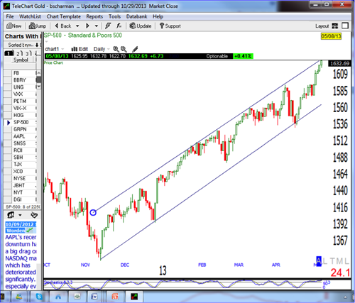
The first step to identifying support and resistance levels is to connect the recent significant highs using a trendline. And next to connect the lows using a different trend line. Once the tops and bottoms are connected this will create support and resistance zones or channels forming the outsides of the channel. Once these trendlines are drawn it is easy to see and identify the support and resistance zones or channels and also identify if they are generally moving up identifying an uptrend or generally moving down identifying a downtrend. This is illustrated in the chart below. Notice the trendline is supporting the market price action as a floor and the market is moving up and down between the support at the bottom and the resistance at the top.

Using Moving Averages to Identify Support and Resistance

Technical traders or technicians use various technical indicators such as moving averages to help market direction for example; however, moving averages can be a powerful tool to help identify potential support and resistance levels. See in the Chart below of the S&P 500 how the 40 period moving average (SMA) is very good at predicting market bottoms and the market “bounces” off of these levels or floor in an uptrend. The same is true of markets in a downtrend using moving averages to identify when the market is bouncing off of the moving average at the top or “ceiling” of the market.

Conclusion

Support and resistance is used by traders every single day whether they realize it or not. By identifying support and resistance zones, using trendlines or moving averages in the beginning can help to identify the areas of turn or bounces as some of the best places to enter trades into the markets as the market trades between these channels Floors to ceiling in an uptrend and ceiling to floor in a down trend.

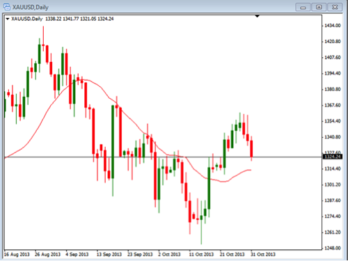
With the recent movements in gold we are going to look at an example of a potential trade setup using just the trend and areas of support or resistance. This doesn’t mean that you should trade this but that you should see the evaluation process that can be used to determine a possible trade.

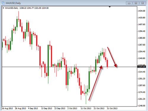
Currently we have seen a bullish move followed by a bearish pull back. Take a look at the daily chart to see how this pattern looks.

In this daily chart you can see the up red arrow followed by the down arrow. The first thing we need to do is determine if the uptrend is strong enough to consider taking a buy position. There are various indicators that we can use but for our example we are going to use the 20 SMA.

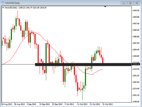
With the 20 period SMA on the chart we can see that the current momentum is bullish. This would confirm our buying bias. With the bullish trend, we are going to look for the price to pull back to a position where it is likely to be bouncing up off of the support area. With the last 3 candles you can see a strong retracement or pull back that is happening. In the next chart you can see where we have identified an areas of support. This would be where we would look for the price to begin to move back up in the direction of the bullish trend.

This black line represents the area on the chart where there has been some support and resistance levels in the past. This would be where we would look to enter a trade once we have seen confirmation of the move back in the trend direction.

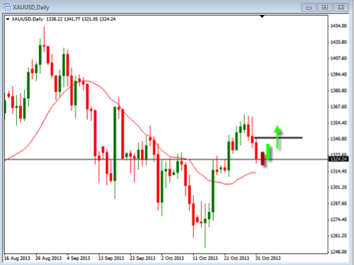
So now, the questions is, what are we going to use for confirmation that the trend is resuming? Well, there are many different types of indicators that we could use but we are going to keep it simple and just use the price and candles to tell us when to get in. In the chart below we have identified where this area is going to be.

We have placed a couple of “pretend” candles on this chart that shows a potential price movement. The black horizontal line represents where we would look to enter the trade. This confirmation of price action allow us to have confidence that what we thought might happen, actually is. In this example, we are using the high from 3 candles back to show us that the price is beginning to move in the direction of the trend. Once this price level has been achieved, we will enter the trade by buying the position. The entry can be done by using a buy stop order to get us in.

Regardless of what you trade or how you trade it, you will want to have a process that you go through when evaluation your charts. In this example, we used a simple method to determine where we might enter a trade buy analyzing the trend and the support level. Take some time to review your process so that you understand when you should be entering your trades.

Technical Indicator: Parabolic SAR (Stop and Reverse)

The parabolic SAR is one of the technical indicators that is included with most charting software, but many new traders have not heard or it or do not know much about this indicator. Today I would like to explore the parabolic SAR and how best to use it.

First of all, what is the parabolic SAR and where did it come from? The parabolic SAR was developed by the Welles Wilder, the same person who created the very famous technical indicator, the relative strength index (RSI). Traders most often use the parabolic SAR to help determine the direction and strength of a market’s momentum and when that momentum may be weakening and when the market may change directions. Traders in all markets can use the parabolic SAR, whether trading stocks, Forex, futures, options etc. 

Using the Parabolic SAR to Identify Market Momentum

Understanding which way the momentum is headed is very important to any trend trader and is a key to the parabolic SAR indicator.

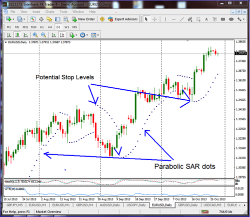
The parabolic SAR is graphically displayed on the chart as a series of dots above or below the market’s price. If a dot is displayed on the chart below the market it is understood to be a “bullish” signal, indicating to a trader that the momentum is to the upside. On the other hand, if a dot is displayed on the chart above the market, it is understood to be a “bearish” signal or an indication that there is momentum to the downside. Also, it should be noted that the dots move dynamically with the market momentum, so as the momentum picks up or accelerates, the line of “dots” angle will increase as well.

See chart below:

Using the Parabolic SAR to Identify Entry Signals

For a long entry you can look for a parabolic dot painting at the most recent low once the market has started to move upward; for a short entry, once the parabolic SAR has placed a dot above the market at the most recent high. As the trend develops, the parabolic will continue in with a line of dots above or beneath the market supporting the trade and becoming steeper as the momentum builds in that direction. The parabolic SAR works best in a market that is trending.

Using the Parabolic Stop to Identify Exits (Stop and Reverse)

Parabolic SAR is a great indicator to help identify a change in direction and when to exit a trade. If the momentum shifts, as indicated by the parabolic SAR, it is time to close a trade. If in a long trade and the parabolic dots shift to the top of the market, close the trade and look enter short the market. If in a short trade and the parabolic shifts to the bottom of the market, close the trade with a buy to cover order and look for the long momentum to start. Hence the “SAR” Stop and Reverse in the name.

Conclusion

One of the best things about the parabolic SAR is that it is a very mechanical way to follow the market so it is very good at helping traders stay in good trades to maximize profits and not exit early and then exit trades once the momentum has shifted without getting emotions involved in the process. The parabolic SAR can bring more disciple to your trading – give it a try!

I had a chance to spend a day with a few people this past weekend, two of which are white-collar individuals that work at a very large corporation and a self-employed individual; there were eight married couples at the event. The purpose of the event was to help one of the couples pack trailers for their move across the country. The main earner in their family had recently retired from the same major corporation that two of the others currently work at and they decided to sell their home and relocate. More than one time, the group conversation turned to politics with the main topic being Obamacare. The general comments ranged from outrage to bitter disgust.

The recent retiree was a higher-level manager who stated that, due to Obamacare, since they would now be out of state retirees, the company that they retired from would not provide them with medical coverage that is comparable to what they have now, which is an HMO. They looked for the most comparable replacement coverage that they could find and the quotes came back in the thousands of dollars, not thousands per year but thousands per month. A couple that has just retired with a very nice retirement income from a major corporation is getting medical insurance quotes that are unaffordable for them. This, of course, made me wonder what happens to all of the people that are retired or are soon to be retired that are a lot less financially affluent; if this couple is having trouble finding affordable medical coverage due to Obamacare, there may be a lot of people who are in trouble or going to be in trouble due to the rising cost of their medical coverage.

Another of the married couples, one of which is still working at the same company, were just informed that, due to Obamacare, their medical coverage premiums will increase by $5,000.00 to $6,000.00 per year, which is an increase for them of approximately 55% to 60%. I don’t know what their annual income is but it doesn’t take a lot of math skill to determine that if it is $100,000.00 per year this is a 5% to 6% pay cut. Even if it’s $150,000.00 per year, it’s still a 3.3% to 4% pay cut.

The self-employed person stated that he has an individually purchased medical policy with a major insurer that he has had for several years with a mid-range deductible of $2,500.00. He stated that when Obamacare was first introduced he was angry, then he found out that it was stated that you will have a choice to keep your current policy and that only very high deductible policies may be affected so he was less angry. He found out last week that, due to Obamacare, his current policy is being cancelled and he has to reapply. The estimates of the monthly premiums for his new policy are substantially higher than what he has been paying up until now.

I read an article, written by an economist, that stated that Obamacare only works if they can force young healthy people to participate. This, of course, is the reason for the penalty for not participating; if they do to get enough young healthy people to pay into the system to cover the cost of unhealthy and low income people, healthcare costs will skyrocket and less people will end up with coverage after Obamacare than before it. I have also read numerous articles about how China and Russia, the largest communist and socialist governments in the world, have been changing the structure of their economies to be more capitalist based, which is evident by all of the business that both countries have been doing all over the world and by how well their economies have been growing. It makes me wonder why other countries have come to the conclusion that socialism/communism, as an economic structure, does not work, but the United States, which is supposed to be one of the more capitalist based economies in the world, is trying it? The Chinese and Russians are moving to a more capitalist-based economy and we are clearly trying to move to a more socialist based economy, which we already know won’t work. When I see something like this happen, the first things that I always ask are:

“Who is winning from this?”

“Who is profiting from this?”

“Who is really in control of our government?”

Last week I discussed what stop loss orders are and the importance of using stop loss orders to manage your initial risk. Today I am going to discuss the use of trailing stops on your trades once they are “in play”.

What is a Trailing Stop Loss Order and how do they work? Just like initial stop loss orders, the trailing stop promotes trading discipline by taking all of the emotion out of the “exit” decision, thus helping traders and investors to protect profits and account capital. There are two different kinds of trailing stops – automatic trailing stops and manual trailing stops. The benefit of an automatic stop order is that can be set at a predefined percentage away from a stock or other securities current market price. A trailing stop for a long position would be set below the security’s current market price; for a short position, it would be set above the current price. A trailing stop is designed to protect profits in the security by enabling a trade to remain open and continue to profit as long as the price is moving in a positive direction either long or short, but then closing the trade if the price changes direction by a specified percentage, letting the trade exit or “stopping out” at the current trailing stop level. With a manual trailing stop, you would move the stop up or down (whether going long or short), in the direction of the trade using some method such as the low or high of the last 3 bars, for example. The advantage to using a manual trailing stop, depending on the method used, allows you to scale the trailing stop using current market ranges, instead of preset percentage as in an auto trailing stop.

An example of an automatic trailing stop is a stock that is $50 dollars at market and you place an entry order. At the same time you place a trailing stop 5% away from the market. As the stock price moves 5%, the trailing stop will move to break even and then continue to trail on up every time the stock moves another 5%.

One of the trickier things about a trailing stop is how far to place it away from the market. In our example, if you place the trailing stop at 5% and that is too tight for the market, you may get stopped out prematurely, or if, on the other hand you place it too wide, you run the risk of losing too much capital or not protecting enough of your profits. This issue applies to either a manually adjusted trailing stop or to automatic moving trailing stops.

The real advantage to using trailing stops is that you will be able to reduce your risk as the stock or other security moves in your direction and once you move past break–even you will start to protect profits along the way. So always use a stop loss order and it you want to extend the potential profits instead of using a fixed target, use a trailing stop loss to exit your trades.

Over the past couple of weeks we have seen the movements in gold be a bit volatile. This has also been seen in the silver market. Now that the government shutdown is over, at least for now, we are likely to see some more deliberate movements begin. So, this week we are going to discuss the daily chart of silver to look for possible trading opportunities. We will look at the trends along with the areas of support and resistance.

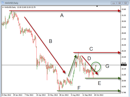
Take a look at this chart below. It is the daily chart of the XAGUSD, which is the chart of silver. We will evaluate each one of the lines on it.

 A. Long-term resistance

Whenever we analyze a chart we need to start by seeing what has been happening over a longer time frame. This gives us an idea for where the price may encounter a difficult time moving above. In this case, the long term resistance is well above there the price is currently sitting. This makes it a bit less relevant as the price has a long way to go before reaching it.

B. Long-term down trend

Line “B” shows the big move that happened as the price came off the high area of resistance. This is a major factor in evaluating what is happening with silver. Because of the overhead resistance and the strong down trend, we need to be aware that the price momentum which has been bearish will be difficult to change.

C. Intermediate-term resistance

As we begin to look at this line we need to recognize that it is becoming more relevant as it is closer to the current price. This would be the next level where any up move would have difficulty with. We need to know this in order to properly identify our areas of targets or stops.

D. Intermediate-term down trend

This down trend line is critical because it is the current momentum on the chart. Price has been moving down and we need to recognize that this is the momentum that needs to be broken to in order to see a change in current price action.

E. Intermediate-term support

This support area will be used to look for places to put the stop losses if we were to take a long position. It will also be an area where a short could be considered on a break down through this area

F. Long-term support

This is the area where the price will have difficulty moving below as it is likely to encounter buying pressure for some time.

G. Breakout

As you look at this breakout area you will see a point where there may be a change in momentum. Looking to enter as the price broke above the intermediate down trend line would have given a place that showed confirmation of the bullish move. In addition, you would look to place stops below the lower support with the target near the resistance above.

Take some time to review this chart to see if you can identify and other potential important areas. Over the next few weeks keep an eye on silver to see if you can see opportunities for some additional bullish movements to trade.

Today I am going to discuss stop loss orders. Placing Stop loss orders may seem like a simple thing but is a very important part of a good overall trading plan, no matter whether we are trading stocks, ETFs, Options, or Forex. New traders may ask, “What is a stop-loss order?” A stop-loss order is an order placed with the broker to exit a trade (either buy or sell, depending on whether we are long or short) once the price has hit a certain price level. For example, if you enter an order to buy a stock at $50 and place a stop-loss order at $48, the trade will be closed out once the price hits the $48 level.

One of the advantages of using a stop loss order is that you don’t have to worry about the risk in the trade. There is not a hard and fast rule about where to set your stop loss orders. In the past, we have discussed ‘risk management’, which is really the science of understanding, quantifying and controlling our risk to a certain fixed percentage of your overall account. The initial stop is the key to limiting our initial risk in any one trade. If we trade without that initial hard stop loss order, we leave ourselves completely exposed to market risk. So it is critical to our long-term success that we ALWAYS use an initial stop.

When we look at trading, there are always tradeoffs or advantages and disadvantages to our actions. Another advantage to placing the stop loss order is that you don’t have to watch the trade constantly or, what I refer to as, “baby sitting” the trade as the stop loss order will automatically exit the trade.

Now, on the other hand, a disadvantage to placing the stop loss order is that you may get “stopped out” of the trade if the stop loss order is placed too close to the market price when the order is filled. If we do not allow enough room or space for the stock to move in its regular fluctuations, then we may get stopped out prematurely. This is referred to as putting our stop loss orders too tight for the regular movements in the market. So a good rule of thumb would be to look at the Average True Range, or ATR for short, to look at the normal fluctuations in the market of any particular stock or ETF. For example, if the ATR on a daily chart were, say, 5%, then it would be unwise to place the stop any tighter or closer to the market than that 5% or you are “begging” to get stopped out. The other thing to understand and keep in mind is that when the stop loss level is hit, the stop then becomes a market order and will then be filled at market, not necessarily at the exact price of the stop loss. So in volatile market conditions the loss may be larger than we originally calculated. However, this risk is well worth it as opposed to the alternative of not having a stop loss order in and leaving yourself overly exposed to large market risk.

The bottom line is to ALWAYS place your stop loss order to limit your risk, but not place it so close to the market to not allow for normal market fluctuations so we give the trade a change to succeed.

Happy Trading!